
There was a time when web design used to portray the aesthetics and images. But that is a past. Today’s web design is immensely tricky and contains much more than just alluring aesthetics. Now, web designers ought to come up with tons of things other than just the attractive images including the visual appeal (the looks) and the user experience (the functionality). Today, this guide is prepared to make your designing job a bit easier.
We’re going to depict the main theories, approaches, and experiential that will certainly help you to come up with a website along with great design and user experience. In this article, we’ll cover the important aspects of global success such as user journey (the website structure), individual page design, mobile-ready designs and testing.
So, let’s start the tour.
1. User Journey
User journey will cover the structure of a website. You need to be attentive to this very part because this is the foundation of your site. Let’s go ahead and see what come into this category.
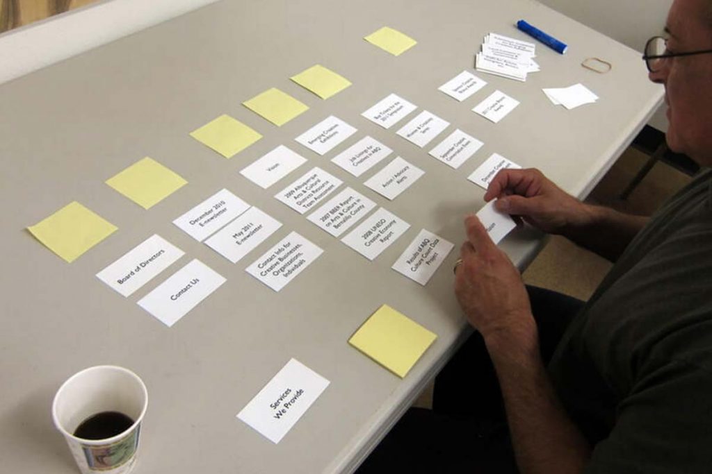
Information Architecture (IA)
Often Information Architecture is considered as the menus of a website but that’s not the whole truth. Yes, menus come under IA but that just a part of an iceberg. There’s more to explore.
IA, by all means, represents the proper organization of information on your site. The organization should be clear and logical so that it helps users to navigate through a complex set of information easily. The hierarchy made by IA meets the user expectation with the right alignment. But the intuitiveness hierarchy doesn’t come by luck; you need to go through a proper research and testing. Here’s how to go:
How to get an intuitive Information Architecture
A handful of methods are there to research the user requirements. Below is the proven technique:
- Information Architect will be an active part of the user interactions or card sorting. This way they’ll be able to understand the user expectations and see how the users are sorting an array of information groups.
- The results of the usability test are also necessary for the Information Architects’ to know since that will explain to them whether the users are finding it easy to navigate efficiently through the site.
- According to the results of user interview, a menu structure is created. And to verify the satisfaction of the user’s manual model, card sorting is tested.
All the above points are required for an intuitive Information Architecture. These are applied before designing the original interface.
Global Navigation
When the topic revolves around usability, navigation is something you cannot ignore. Your superbly built site will also not be able to carry forward your superiority unless the users find their way around your site. Below are the few theories your site strictly needs to follow in terms of experiencing fruitful results:
Simplicity
A simple navigation denotes the least possible clicks that’ll be involved in the navigation to go anywhere a user want.
Clarity
Navigation shouldn’t be vague in terms of meaning. Don’t force users to guess anything. Be clear in everything you have put in the navigation.
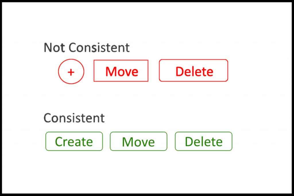
Consistency
Don’t use different navigation designs for different pages. Maintaining consistency in navigation will benefit you in terms of good user experience.
Below are the aspects that need your consideration while developing a navigation section.
Remember User’s Needs
Different businesses have a different target audience. Always remember, you have to have a better idea about your target audience. Obviously, you cannot play a folk song in a rock concert. Similarly, a given target group always assumes a certain sort of interaction from your side but if you offer something else they’ll be dissatisfied. Supposedly, if your site contains hamburger menu while your target audience isn’t much familiar with icons, that would be an issue.
Visible Navigation Options
It’s a proven fact that recognizing is far easier than memorizing. So, instead of keeping any complexity in your site, highlight the important parts of your navigation. That’s how a user would be able to identify the most important parts of your website. Furthermore, make the navigation permanently visible and available, rather than the time when you expect the users to need them.
Work with the Location Indicator
The most common concern a user goes through is where he or she is at a certain time. Being the site owner it’s your duty to satisfy his/her questions by indicating the location of each page on the respective web pages. When your users would be able to get the answer to the question “Where am I?” they are surely going to be glued to your site.
Prioritize Navigation
Set the priority level of your navigation. Allocate the high, medium and low priority levels to the usual tasks and provide the prominence in the layouts to paths and destinations with regular use and high priority levels.
Proper Use of Back Button Function
After the URL input field, the back button is the most popular UI control for the users. You need to be very conscious while implementing the back button because it needs to satisfy the user-expectation. Once a user follows a link on a certain page, he or she expects to get back on the previous page exactly where it was left off. If Your site constantly takes them back to the initial page (i.e. home page or landing page), the users will certainly be frustrated after a certain time. Eventually, you know what is going to be the result, they’ll leave.
Breadcrumbs
Breadcrumbs are the secondary navigation options in a website which work as the contextual set of functions. This secondary navigation aid displays the location of the users on your site. Though there are not too many explanations required in this category, a few things are still there that you need to know.
Breadcrumbs are Not a Substitute for Primary Navigation
Breadcrumbs are the secondary navigations that only work as the substitution of the main navigation. If you try to use the breadcrumbs as the primary one, your site is most likely to fall. Always consider the breadcrumbs as the supporting line, not as the front liner.
Don’t Use Slashes
While using breadcrumbs, the foremost thing to remember is that you should not make use of slashes (/). The recommended signs for separating each segment is either a ‘Greater than’ sign (>) or an ‘Arrow’ sign (à). The reason for using these two signs is because both of these signs indicate a direction.
Search
Always pamper those users who come to your website just for a specific concern. The first thing they’ll need is a search option where they can search their query with a term. If your site doesn’t contain a search button, they are not likely to stick with your site and use the awesomely-built navigation. There are certain rules and parameters you need to make use of while designing your search box.
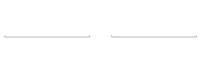
Place the Search Box at a Suitable Spot
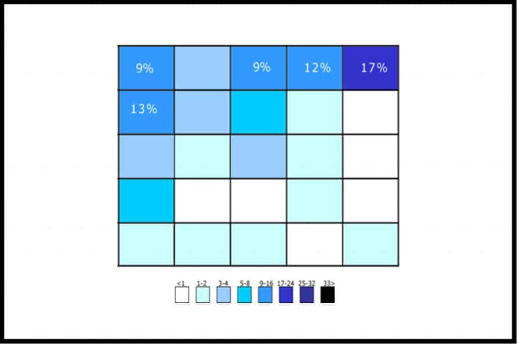
A. Dawn Shaikh and Keisi Lenz ran a study regarding the best place of a search box on a site. The survey, made among 142 members, displayed the expected location of the search box. The study showed the most effective place for a search box at the top-right corner and right under the top-left corner of a website. The place can be determined by a user by making use of the F-Shaped scanning on a website. The above image shows the percentage of overall people and the place of a web page (grid-based).
Displaying Search-Box Prominently on Content-Heavy Sites
If you have a content-heavy website, you need to display the search-box prominently. Since your site contains tons of different contents, naturally, a user would love to search the exact content they’re in search of.
Appropriate Size of Input Box
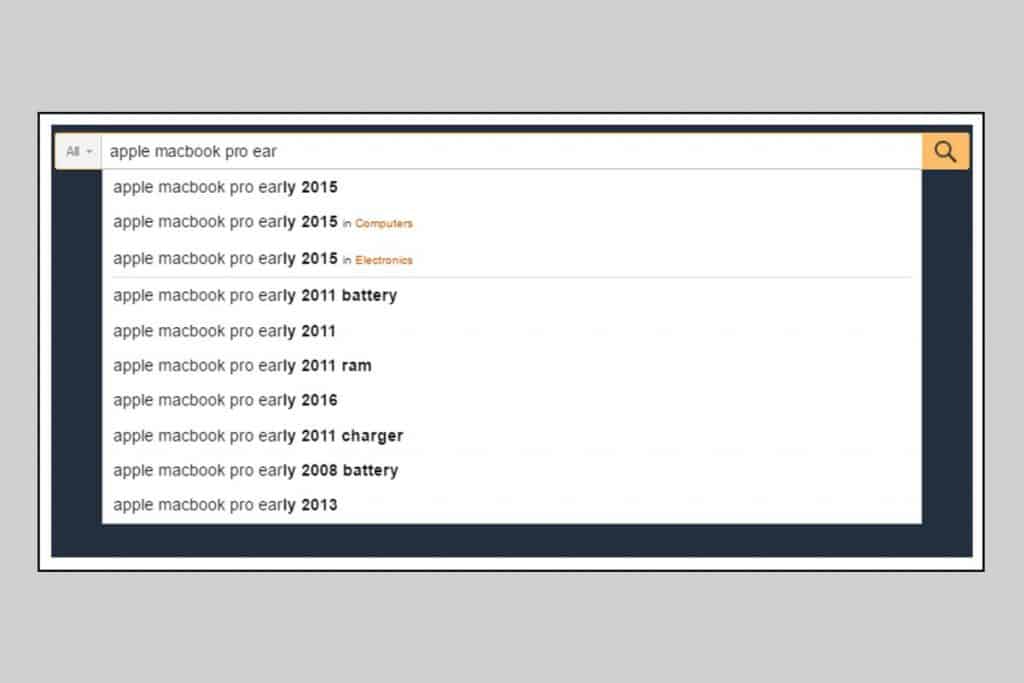
Users can, obviously, go through a long query. What should they do then? If your site has a short input field and users are writing down their long query, quite naturally, they’ll not be able to see their whole query at once. This very point will be a barrier between your website and its success as it’s extremely lethal for your website’s usability. Moreover, another downside of the short input field is its inefficiency of containing the precise queries which certainly hurts the user experience.
Make the Search Box Omnipresent
You need to incorporate the search box on every page of your website. Since a user may require searching for the contents regardless of which page he/she is on, it is wise to put the search box on every page of your site. This will maintain the consistency as well as the usability of the website.
Navigation Options and Links
Links and navigation options are exceptionally vital for the navigation and influence the user-journey. There are a few rules you need to maintain in order to make these interactive components superiorly usable.
Distinguish Internal and External Links
Users always expect dissimilar behaviors from internal and external links on your website. While the internal link should always open in the same tab (which will, eventually, enable your users to use the back button to return to the original page), the external link should open in a new tab or window. But you have to mention that the link will open in a new tab or window. You can do that by writing ‘this link will open on a new tab/window’ or something else along with the text.
Change the Visited-Link Color
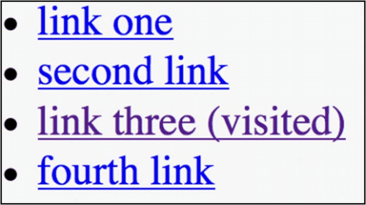
If you don’t change the color of the visited links, it may result in users clicking the same link unintentionally and revisiting the same webpage time and again. This affects the user-experience and creates a sheer irritation for the users. The perfect example of the changed color of the visited link can be found in Google searches. Once you search a term in Google and visit a certain website from the search results, the color of the particular link gets changed.
Verify the Links Properly

It’s highly recommended to inspect the links multiple times with a regular interval. Tons of websites get blocked on a daily basis and that’s the reason you have to recheck the websites to discover whether it’s still running or not! Now, if a user clicks a link and gets into a website which is showing 404 error or something else, it will certainly be a matter of irritation for him/her. They believe every link will solve their queries.
2. Individual Page Design
Individual page design comes second, right after the user journey. The design of the web page is exceptionally responsible for your website’s success or failure.
Content Strategy
Content strategy is one of the most important parts of a successful website. As your website is going to be the place for the audience to know about your business and should glue the users, content strategy will be a great help. You need to recognize the goal of your website, each webpage, and write the contents in accordance with the goal.
We will discuss a few practical aspects that will improve your content strategy.
Preempt the Information Overload
Information overloading is a serious and the most common concern if you’re revolving around the content strategy. The information overloading holds the users back from making a decision or taking an action on a website since they feel that they have a lot to consume! If you want to minimize the information overload, there are a few simple tricks you can avail.
The best technique is chunking: you can break your large contents into the smaller pieces which help the users to understand the subject matter and the procedure described in a content. The checkout form is a perfect example of such chunking. The process includes five-seven input fields at a page while there are multiple pages that proceed the checkout.
Prevent Jargons and Industry-Related Phrases
The industry-specific terms, jargons and technical phrases present on your website would increase the cognitive burden on the users’ shoulders. The secure path is to pick the terms and phrases that are easy-to-read and contain understandable terms to all the age groups and readers.
Avoid Long Contents
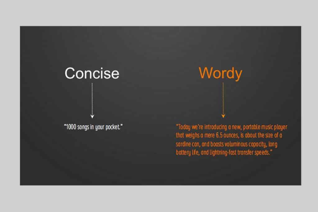
In terms of getting the information overload sorted, you, being the website owner, have to convert the elongated contents into the shorter forms. The long blocks of contents should be avoided for your website unless it’s geared to convey major information.
Let’s say, you need to write a content of a service or a product, then you should break it into small steps with solid information. Avoid incorporating the unnecessary word to lengthen the sentences. It has also been proved that the standard length of superiorly readable sentence is 20 words or less.
Avoid Capitalization of Each Letter
If you’re concerned about readability, you must eliminate the consideration of capitalizing each letter of a paragraph! While All-Caps strategy is fine with abbreviations, and logos, a whole paragraph with All-Caps texts is lethal for readability. It’s been proven that the longer contents with all-caps texts terribly decrease the speed of readability.
Page Structure
The page structure decides the placement of each user interface component in the layout. Though there’s no one-size-fits-all rule, still you can avail a few guidelines which are incredibly helpful for crafting a solid structure. Following are the guidelines you may consider:
Predictable Page Structure
Create designs and layouts in accordance with users’ expectation. If you force them to roam around your page to find certain important components, it’ll directly affect their experience. Explore the similar websites from the same category to recognize which elements to use where. A familiar pattern to your target audience would benefit you.
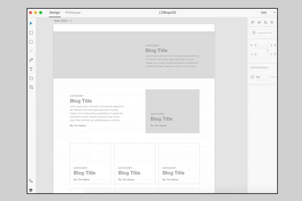
Layout Grid
Using a layout grid brings tons of advantages to your page structure in terms of placing a component and finding the right spot to place it. As the layout grid divides your page into multiple sections, you get the major regions of a webpage. Moreover, it outlines the associations between components in terms of size and position. It’ll become superiorly easy to combine different parts of a page together with the help of grids.
Use Wireframe to Cut Out Clutter
The cluttered interface can never be fruitful to your website design since it decreases the comprehension. Each button, image, and text will make the screen more complex. We recommend that before incorporating the real images, texts or buttons, use a demo wireframe to decide which is necessary and which element can be cut out.
Visual Scale
People these days are more likely to scan a webpage than reading it from the top to the bottom. So, whenever users enter to your website, they scan the page till the moment they find where to go. A properly designed visual hierarchy will help them find the way through the website.
If you’re unknown to the term ‘Visual Hierarchy’, you need to know that it is the practice of presenting or arranging the components of a webpage according to its importance or focal point. A prominently built hierarchy would make the scanning part of a website easier for the users. Let’s discover the major aspects of the visual hierarchy.
Make Use of Natural Patterns
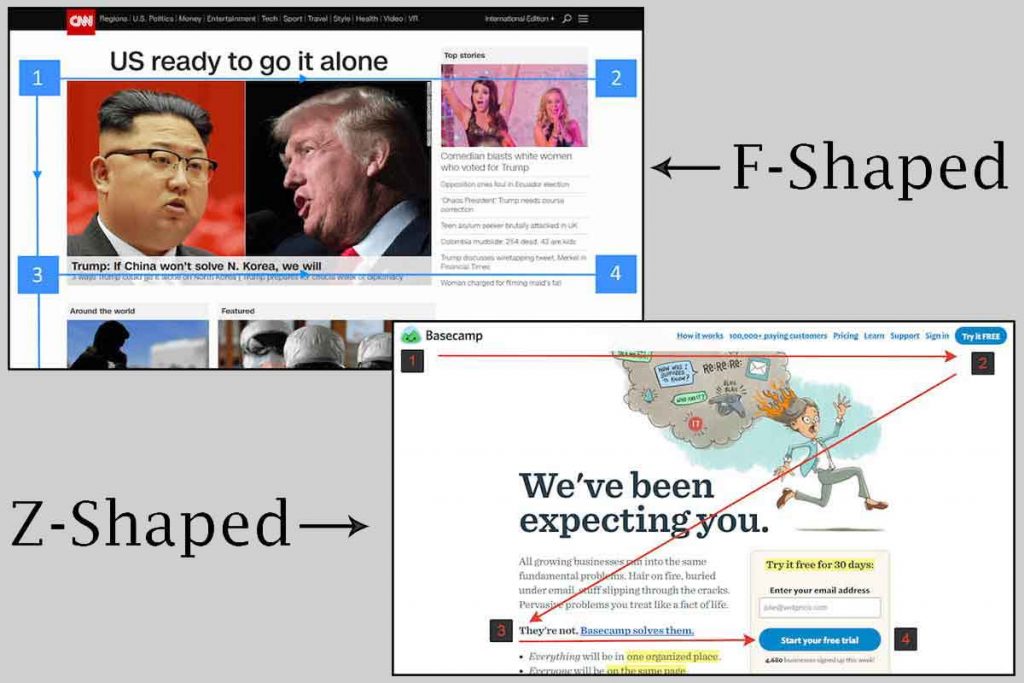
Designers have the utmost power in their hand to play with visitors’ attention. You have the ability to bring their eyeballs to a particular portion of your webpage and control their vision in terms of where they’ll look next. There are two design patterns that can help you in directing the users’ vision: F-Shaped and Z-Shaped patterns.
If your website is mostly text-oriented, the F-Shaped pattern will be the best assistance, and if your site isn’t content-heavy, you can follow the Z-Shaped pattern.
Prioritize the Vital Components Visually
You need to give importance to the sections of your website-contents which, you think, will be crucial for the users. The screen titles, navigation options, log-in forms and rest of the important contents the focal points for users. Doing so will increase the readability and induce users to take actions on those portions
Create Mockups for Better Visual Hierarchy
Rather than making any changes during the development stage, it’s easier to do it in the mockup stage. Mockups allow the designers to verify the end-result of a web page layout. You can easily rearrange the elements in the mockup page if you find the mockup inappropriate.
Scrolling Performance
Often web designers believe in the myth that nobody scrolls. But, in today’s date, everybody scrolls! So, you need to work on the scrolling performance in terms of having the audience engaged to your page. Following are the few tricks to do it:
Induce Users to Scroll
Despite the fact that users generally begin to scroll right after the page is loaded, the top content is still a crucial factor. The content appears at the top creates the impression to the users and stimulates them to know more by scrolling down. People will certainly scroll but only if they find the top content compelling enough. Below are the tips for incorporating the most intriguing content at the top of your webpage.
- A well-written introduction always conveys an exceptional context regarding the content of the page. So, try to write down the best introduction that can make the users gape in awe.
- Another proven technique to engage the users and stimulate them to scroll down is to use appealing images. It’s been proven that people pay more attention to the images that deliver better information.
Constant Navigation
If you’ve created a longer page, and it’s compelling enough for the users, they’ll still need to know their current location and see the navigation options at any point in time. Having a long page will make it problematic for the users to find the navigation options since the top navigation loses its visibility once the users scroll down. The difficult part is users need to scroll up to find the navigation options if it loses its visibility. One clear solution to this problem is to have a sticky menu bar that glues the navigation bar no matter how much you scroll.
Visual Response to Content Loading – Loading Indicator
The visual response while loading content is one such designing aspect that needs attention but often ignored. If your content loads dynamically (like the news sites), you have to incorporate a fast content loading option (2-10 seconds) with some animation to depict that. The looped animation can be used to indicate that the system is responding and contents will be loaded shortly.
Avoid Hijacked Scrolling
Hijacking the scrolling is one of the most lethal mistakes web designers do. The hijacked scrolling can become one of the matters of irritation for the users. If users are not able to scroll in line with their desire, they’ll naturally be annoyed. The hijacked scrolling makes the scrolling behavior unpredictable for the users. If you want decent user-experience on your website, let the users scroll as they want to.
Content Loading
Content loading is undoubtedly one of the vital aspects of a website’s success. It can single-handedly write your website’s destiny. Despite the fact that your website should provide instant content loading, there’ll be certain occasions when your site will take more time to load the contents. No matter why it’s happening, you need to make your website load faster. Below are the points you need to keep in mind while working on faster content loading.
Regular Content Loading Should be Fast
Users won’t give you too much time. The attention span and patience of the web users have gone for a toss these days and they are likely to provide you a maximum time limit of 10 seconds on a single task. When visitors need to wait for a longer time to load a content, they’ll be most likely to leave the site. Even if you embed the most beautifully designed loading indicator, it won’t be enough to keep them on the site.
Use Skeleton Screens
Yes, a progress indicator is hugely used by numerous web designers to display that the contents of a page are loading. While the loading indicator would provide the visual feedback, it may backfire since each second of loading time seems to be decades for the users.
There’s a worthy alternative to the progress indicator – Skeleton Screen. Initially, a temporary blank version of the whole page is loaded with Skeleton Screen. The main contents gradually load on the blank page. Instead of the loading indicators, users may make use of the Skeleton Screen to create an eagerness of what’s coming!
Buttons
If you want to have a smooth flow of conversational interface, buttons can be a tremendous help to you. Below are the best practices of buttons you may consider while designing your webpage.
Clickable Components Should Look like Clickable
If your site contains interactive components (such as buttons) in it, make sure your design conveys the affordance (how it should be used). You need to ensure that users are recognizing the buttons on your web page as a clickable option. The components in your web page that look like the links or buttons but don’t provide the functionality may put the users in confusion. For instance, if you have an underlined text or any component that includes a background in your web page, users may easily get confused whether it’s a link or a button.
Label the Buttons as per Its Action
Each button in your website should portray their individual actions. If the users don’t get a clear idea what a button would result in after clicking, they’ll not be very certain to take any action. The unclear labels like ‘Submit’ will make users confused about what the button truly does. So, the bottom-line is you have to provide sufficient information in a button.
Consistently Designed Buttons
Psychology says that users remember each pattern details they see (deliberately or instinctively) while browsing through a website. They keep a particular design pattern in mind when coming across a pattern for the first time. Thus, if you use different shapes for the buttons in your webpage, users are more likely to get confused and it will certainly decrease your website’s user experience.
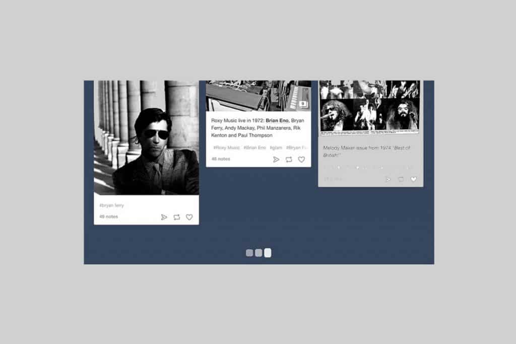
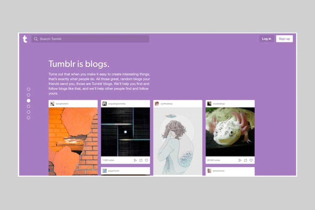
Imagery
An image is worth a thousand words. Yes, the old saying is still so relevant that nobody, including the website owners, can ignore it. So, when the individual page design is concerned, images can make a huge difference. Human beings can process the visual info almost immediately. Among the information that is noticed and transmitted to our brain on a daily basis, 90% is visual. Prominent images can express far more than a superiorly designed chunk of texts. Moreover, images aren’t limited to the language. Below are the theories you may apply in terms of incorporating the best images on your site.
Contextual Images
The images you choose to display should be able to deliver the goal of your products. The contextual images that are relevant to the subject are highly recommended. If you select an image that doesn’t convey your website goal or the goal of your products, you’re certainly going to experience a downfall.
Avoid Using Generic Images of Individuals

While making use of human faces instigates the user to trust more, it can backfire if you use the stock images of people. Seeing the faces of other humans makes the users feel more humanly rather than feeling being forced to buy a product. But the scenario with stock images is completely opposite as people easily understand that those aren’t real and they consider the website as pretenders. Consequently, it diminishes the user-experience rather than improving it.
High-Quality Images with Zero Deformation
Your website’s quality in front of the users will tremendously depend on the quality of the images used on the site. Both the impression of the website and the expectation of the users will get hurt if not your website’s assets are crystal clear, and appropriately sized across all devices. You need to test the resolution of every image with different ratios and devices to ensure that those aren’t getting pixelated. The original aspect ratio of the display pictures and graphics will be the first impression of your site that will last.
Video
Since videos stretch users’ time spent on a website, it has become a necessity for the websites. Especially when internet speed is at its peak, videos in a website are turning out to be more popular. The video is the most powerful tool to grab users’ attention when used prominently. Videos carry more emotions and offer a real touch and feel of the product a website is endorsing. Here are the techniques to effectively play videos on a website:
Turn Off Audio by Default with an Option to Turn On
You need to consider that the majority of the users don’t make use of headphones. So, when they arrive on your website, a video played with audio will freak them out. While they’ll certainly not expect the video to play with sound, it’ll be stressful for them to find out how to turn off the audio part. And believe us, they’ll simply leave the website!
Use Short Videos
A research of D-Mak Productions showed that short videos make a better impact on the users. So, keeping the business videos as short as possible (two-three minutes) is the best solution.
Alternative to Access Contents
You need to provide alternatives to the contents present on your website. If you only keep the videos it will result in a limited access to the contents. Those who cannot watch or listen to the content won’t be able to access the video! So, the best solution for accessibility is to integrate a transcription or subtitle of the video along with it.
Call-To-Action (CTA)
Call-To-Action is the button that leads your users to the ultimate motto of your website – conversion. The main motive of CTA is to direct the visitors of your website to a certain course of action. Through CTAs, you induce a visitor to take an action that can ultimately lead to the conversion. Below are some examples of CTA:
- Subscribe to Newsletter
- Download Our eBook
- Sign up for Updates
- Start Trial
You need to be very careful while designing the CTA buttons. Have a look at the points below to get a better idea how to make a great CTA button.
Size
The CTA button should be big enough to come under the sight from a distance but not so large that it distracts a user from seeing the other contents of a page. You can verify if your CTA button has the right size by a simple method! A five-second test will tell you whether the CTA button you’ve designed has the prominent size. Just view a webpage for five seconds and note down what you can recall. If you find the CTA in the list, you’re on the right track.
Visual Accuracy
When it comes to visual prominence, the color of your CTA button is going to have a huge impact. By using a different color for the button, you can make the button stand out among the other contents present on a particular webpage. If you use contrasting colors, it’ll bring out the best result.
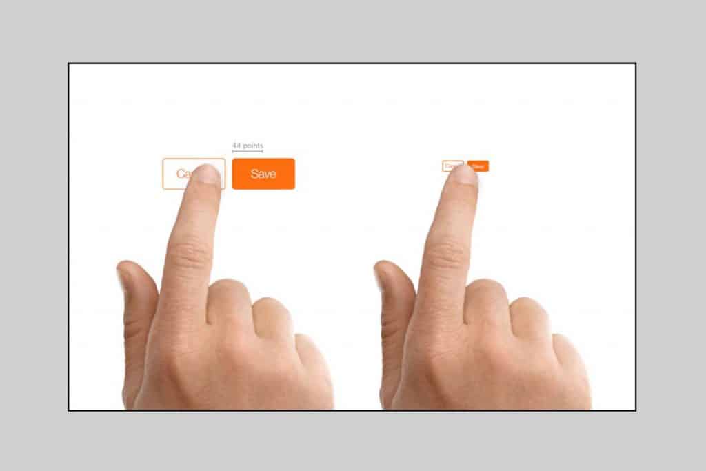
Space
If you’re serious about conversions, you need to be serious about the CTA buttons. And if you’re serious about the CTA buttons, you ought to be serious about the negative space between two CTA buttons. Yes, the Negative Space is the White space you leave between the CTA buttons to let users have a fresh breathing. This space separates the CTA from the other contents.
Action-Based Text
Induce your users to take an action every time they visit your website. Just using CTA won’t bring much value but you need to make it more compelling in front of the users by starting the CTA with the verbs like ‘Start’, ‘Join’, ‘Get’. Users will be encouraged by these words to take an action.
Tips to Verify
If you want to verify if the CTA used in your website stands out among the other content, you can run a quick and simple inspection. Get your webpage ready with other contents, images, and CTA. Now take a screenshot of the page and blur it through Photoshop. If you find that the CTA is grabbing your eyeballs then it’s okay; if not, revise it.
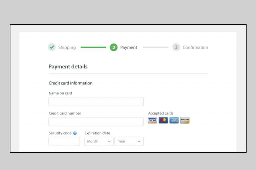
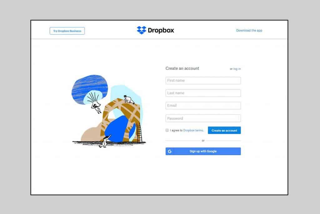
Web Forms
The forms still remain one of the most vital aspects for the users to communicate online. To complete the goal of conversion, forms are still one of the best bets. Users should be capable of completing the forms quickly without any complexity and hassle. A web form is considered as the tool of communication, and like any other communication, it should also involve two parties: the users and the website. Here are a few tips you need to follow while incorporating a web form:
Incorporate the Required Fields
Only embed the fields which are absolutely required in the form. If you add a single more field, it will have an impact on the end-result i.e. conversion rate. If you’re confused what to add in the form, think about the information you need the most from the users. If you know what you want and how you’ll use it, you’re going to build a great web form.
Logical Formation of the Form
Ask the questions from a logical point of view. If you don’t pay attention to the users’ perspective while ordering the form, it will affect the result. Supposedly, if you ask for the users’ address before their name, it will hamper the user experience.
Gather Related Fields in a Group
Accumulate the related information sections into logical sets or blocks. You need to maintain a flow of conversation from one set of questions to another. The grouping of related fields also helps the users to get an idea of the information and its requirement.
Animation
Animation has always been fun, and that’s the reason designers are incorporating the fun part in the websites to give the users a fresh air in the hardcore technicalities and professionalism. Animation can immensely improve the user-experience and that’s why it’s not a fad anymore. But you need to be cautious regarding the prominent place and time of playing the animation. You need to understand that a prominent animation includes both functionality and meaning. Below are the cases in which animation will be the best option to enhance the user experience:
Visual Response to User Action
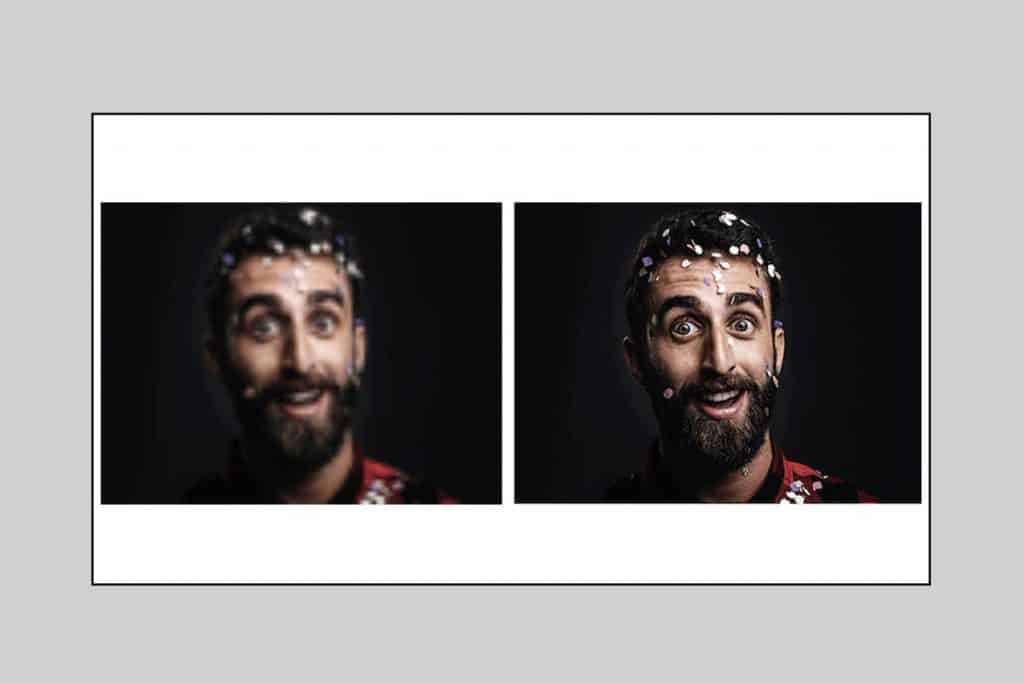
Animation can be used to give a visual feedback in return for the users’ action on your webpage. If you want to create an interaction through your website, animation can turn out to be the best help for you. If an operation made by the users hasn’t completed successfully, an animation would be the best gesture to address the issue.
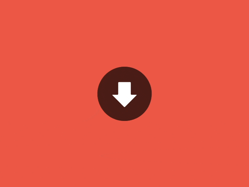
Let’s say, a user has written down the wrong password, then a shaking animation on the password field will portray the problem better than anything else. Moreover, since shaking the head is a universal gesture to say ‘No’, it completely makes sense. (As described in the above GIF)
Visibility of Running Operation
Suppose, you are uploading a file or downloading; if you don’t know how much data have been uploaded or downloaded, it’ll create a sheer hassle for you. If an animation gives your users the visual feedback of the operation, they can plan ahead.
This is one of the most useful animation systems you can use to enhance the user interface design. Users may want to see the status of a running program or operation at any given time. If you, as the website owner, is able to inform users the status not only through texts but through the animations, they’ll certainly be impressed with you. You cannot keep your visitors guessing, they need to know their operational status.
Navigational Transitions
Navigational transitions involve the movement between different states of the website components. For instance, moving from the basic view of a navigation to the detailed view can be called a navigational transition. For the most cases, the transitions involve a hard cut which becomes quite hard to follow.
But if you make use of the animations, it will smoothen the process of transporting the users between navigational context (navigation menu) to explaining the changes on screen by creating a visual connection between the different states of a particular context.
Branding
The branding animation will play a pivotal role in leaving an impact of your website among the users. Moreover, the branding makes an emotional bond between a user and a website. With the growing technical know-how among people, a scenario will come when there’ll be dozens of similar websites that provide best user experience and prominent functionalities. But you need to create your own unique identity! In such case, branding should be the first and the last consideration of yours.

Branding, single-handedly, can make or break the future of a website. So, if you make use of animation on the homepage of your website, it’ll make a huge impact on the users. And undoubtedly, your brand will be remembered.
3. Mobile Consideration
More than 50% of the global internet users make use of their little handy mobile devices to surf the internet and satisfy any concern. Saying that we mean that you, being a designer, must know how to make your website design mobile-ready. You must have a strategy for the mobiles if you really want to design a successful website.
Responsive Design
It’s immensely important to pay attention to both the desktop and mobile users. If you don’t do that, you’re not going to taste success. There’re different screen size, resolution and manufacturer, so, make sure you have come up with the right design for mobiles. Otherwise, you’ll never be able to get hold of the mobile users. Below are the top tricks you need to keep in mind while designing a responsive website:
Single-Column Layout
The single-column layout is, considerably, the safest option to go with. It works best with the mobile screens considering the small screen size. But the awesome advantages of the single-column layout are not only limited to the small screens, but the single-column layout also has a huge scalability between the different resolution and between landscape and portrait modes.
Priority+ Pattern
Priority+ is the responsive pattern that describes the navigation option that exposes and highlights the most important elements and hides the least important elements behind a ‘More’ button. The best part is that the navigation elements are not static. They are variable with the screen size of the device that opens the Priority+ patterned website. The larger screen space the responsive pattern gets, more elements it will display and less screen space encounters vice versa.

If you have a content-heavy website (news or blogging website), this pattern is tremendously useful for you. Since you have a lot of sections and contents to show, this pattern will fit your site into the tiny space of mobiles and will highlight the most important section of your website through the navigation bar. If you want to see all the sections, click or tap on the ‘All’ button from the navigation menu.
Optimize and Resize Images Accordingly
When it revolves around mobile responsiveness, you need to take immense care of the orientations, pixel densities, and resolutions. Your website should look perfect on every device. While doing that, images are the objects that’ll create the toughest challenge in front of the website designers. You can make use of free or paid tools to generate the different breakpoints of responsive images.
Turning Clicking to Tapping
The main difference between using the web on the desktops and mobiles is clicking and tapping. While on the desktops, you need to click each button, on mobile devices, you need to tap. So, while your fingers are working as the clickable cursors, there are a few aspects to keep in mind:
Prominent Size of the Touch Targets
You need to make sure that the users can tap the interactive components in a website. While the links, buttons, and menus can be kept small in the desktop, mobile sites need to have those elements big enough that users can tap them with their fingers. As you can click the elements with ease using the mouse pointer, your fingers are not as precise as the pointer.
Reports show that the usual size of the finger pads is 10-14 mm. and fingertips range from 8-10 mm. So, having the buttons with 10×10 mm of size can bring the best result.
Mobile Sites Should Signify the Interactive Elements Prominently
On desktops, you, being the web designer, have the liberty to make use of hovers. So, when a user hovers his/her mouse pointer on the website, the functionality will seamlessly work. But with the mobiles, the challenges are bigger! Since there’s no hovering option, you need to display the interactive elements in a way that users get a vibe about its interactivity. Thus, a visual significance is always required in mobile-responsive sites.
4. Accessibility
This is one of the vital parts of a website’s success but often neglected. Your website, in today’s date, needs to be accessible to each individual regardless of the abilities. Designing for the users with disabilities will not only sharpen a designer’s skills but it will bring a strong empathy to his/her personality. They will be able to view the world from others’ perspective. So, we’re here to inform you how to design a site for ‘everyone’.
Users with Poor Eyesight
Lots of websites have been noticed to make use of the low contrast texts. Maybe the low-contrast texts are in trend right now, but it’s inaccessible at the same time. The people with weak vision and contrast sensitivity will suffer the most with the poor contrast of text color compared to the background.
While low-contrast texts are already very tough to read on desktops, naturally, it’ll be harder on the mobile devices. Imagine the scenario of trying to read the low-contrast texts in bright sunlight! If you’re opting for the best design, create an accessible design.
If you’re giving up accessibility for aesthetics, you’re not on the right track! The most important feature of a well-designed website is readability, and it’s applied to all vital elements including texts. You can check the readability of your website’s content by following the W3C’s Web Content Accessibility Guidelines (WCAG). WCAG provides two contrast-ratio suggestions for small and large texts:
- Small text’s contrast ratio should be at least 4.5:1 and the recommended ratio is 7:1.
- Large texts (18p Normal, and 14p Bold) should have 3:1 contrast ratio compared to the background.
Color Blinds
It’s been shown by a survey that among the global population, 4.5% people are color blind, 4% have low vision, and 0.6% people are blind. While it’s easy for most of the designers to forget about these individuals since they don’t come across more often with them and their impairments, a successful and accessible website design is crafted keeping the visually disabled in mind.
There are some instances where color is the only medium to convey the meaning of certain sections. While it’s quite fashionable for you, there are some people who suffer from a lot of hassle due to their visual inefficiency and color blindness.
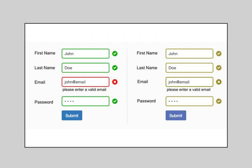
Often, we encounter the web forms where ‘Green’ symbolizes ‘Correct’ and ‘Red’ depicts ‘Incorrect’ input. The fact is these are the two colors from which color blinds suffer the most. Moreover, we’ve also seen the forms where a section above the form says ‘The fields marked in red are mandatory to be filled’. These sorts of color dependence will hamper your website’s accessibility.
You can obviously use the colors to enhance the aesthetics part but never forget to write down the purpose of the field or the result it’ll provide. This way, your impaired website visitors will also be able to understand the action required.
Blinds
When we’re talking about blinds, the most important part is the images. Since blind users make use of the screen readers to recognize the contents of a webpage. These assistive technologies work great to provide them the best interpretation of what’s there on a webpage.
But as we have mentioned the images above, those visual content cannot be read! So, how the blinds are going to access the images? The answer is ‘Alt Text’. Yes, the alternative texts are not only limited to provide value to the SEO, but it’s the most useful way to inform a blind visitor about the image.
While writing the alternate text for any image, make sure you’re describing the image properly. Because without proper description, the screen readers won’t be able to offer you much information about the image. The more ‘meaningful’ image you have on a webpage, the better description it requires. However, an image used just for the sake of decoration doesn’t need any ‘Alt-text’ since it doesn’t convey any useful information regarding the webpage.
Keyboard-Friendly Functionality
Many people navigate the internet by their keyboard. The individuals with motor impairment cannot move their muscle effectively which is required when you make use of the mouse. Now, it’s the responsibility of the designers to create a keyboard-friendly functionality which will meet the motor-impaired individuals’ need.
You, being a designer, can make the websites easily accessible to the disabled people along with the proper use of interactive and navigation. The ‘Tab’ key and Keyboard-Focus indicator can be displayed to offer the best assistance. Below are the considerations of a keyboard navigation:
Make the Keyboard Focus Evident and Apparent
A few designers have a tendency to remove the keyboard focus indicator from the websites just because they deem that it’s blemished. But the reality is completely contrary. The removal comes in the way of proper interaction with a website for the keyboard users. If you remove the keyboard focus indicator because you don’t like the default design provided by the browser, you’re doing injustice to the accessibility. If you don’t like it, redesign it.
Accessible Interactive Elements
Users should be able to access each of the interactive components of the website you’ve designed. From the main navigation bar to the small call-to-action button, everything should be clickable directly from the keyboard.
5. Testing
Testing is one of the most important parts of a successful website design. The thorough testing will rectify your mistakes and enhance the design after you fix it.
Repetitive Testing
Repetitive testing or Iterative (Technically) testing is a crucial part of UX designing process. Like every other designing aspect, testing is also an iterative process. Form the beginning till the very end, gather information, and feedback and modify the site throughout.
Page-Load Time Testing
Response time has become a vital characteristic of a well-designed website. Since individuals hate to wait, your website should open lightning fast to meet users’ expectations. As the theory says, there’re three response-time limits:
- 1 Second – This is lightning fast page-loading and users don’t need to wait.
- 1 Second – This will not let users sense any delay. The flow of users’ thought will be intact.
- 10 Seconds – This is the limit! A 10-second delay may instigate the user to leave your site.
It’s quite obvious that none of the website owners want to make their visitors wait for 10 long seconds but let us warn you that the usual loading time of a few seconds may also make a bad impact on your website. Yes, a little difference of a few seconds can also be lethal for your website since people don’t want to wait anymore.
So, let’s take a quick look at the factors that can slow down your page loading time:
- Heavy Content on your site can promptly slow down the page loading time. The HD videos, unoptimized images can be the factors.
- Unoptimized backend codes can also be a reason! Yes, sounds unbelievable but it’s true.
A/B Testing
If you’re going through a struggle to choose between two versions of designs and cannot take the right decision, A/B testing is probably the best solution left for you. Supposedly, if you have an existing design and a redesigned version, this testing method can be immensely helpful to you.
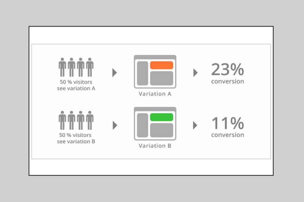
This technique involves displaying either one of the two designs to an equal number of individuals to know which design is mostly liked by the users. The one which will have the best reviewing analytics will be the one you’re going to stick with.
6. Developers Handoff
A successful website design contains two major steps: creating the prototype of the design and coming with the development of a functioning resolution. The step that works as the connector between these two steps is called Handoff. As soon as the design is ready, designers nurture a specification of the design stated how to code the design. This specification ensures that the design is developed and implemented in accordance with the original concept and intention.
The most critical part of the specification part is precision or perfection. If the designers provide an inaccurate specification, it’ll be hard for the developers to pursue with the development phase. They’ll either need to rely on their willpower or have to have a discussion with the designers for the exact specification. This will not only break the flow of work but create a confusion between two vital stages of a website designing and development.
Thanks to Adobe XD’s design specs feature: developers can get the measurements, inspect the flow and copy styles from a design right after the designers publish the design’s public URL there that have been made. This tool relieves the stress from the designers’ shoulder of keeping a track of every aspect of a design: from fonts to positioning.
Conclusion
The above are the overall ideas you need to know if an intuitive web design is your concern. Following the tricks and tips will eventually benefit you massively from the aesthetics to the functionality and accessibility. We believe you’ll apply all the techniques described in this article, and let us know if it has a positive impact on your website design.


