With the arrival of the internet, one thing that has surely taken a fly is the website. Currently, more than 1.8 billion websites are live and certainly, there is a lot more to come. While a never-ending stream of website designing is flowing, your website needs to stand out among all. This is the very reason why web designers are high in demand. A good web designer would not only create an aesthetically alluring design for your website but the design will be intuitive and ready to convert. That’s the very moment where the emphasis in web design comes into play.
Emphasis in Web Design – What is It?
The emphasis on a web page revolves around creating an element or area which is highlighted on the page and the focus point of that page. It is the most efficient way to put the spotlight on the particular component. The focal point may be larger than the other elements on the web page or it can be brightly colored so that it catches the eyeballs of your website visitors and keep them engaged in your site. You can add emphasis by selecting a word or phrase and supplementing it with color, font or size which are suitable to make it stand out. However, there are other ways to use emphasis in web design besides the mentioned.
Use of Emphasis in Web Design
One of the most frequent and common mistakes web designers usually do is they try to make each and every component of the design on a web page stand out. When you put equal emphasis on each element of your design, the design, eventually, looks congested, busy and confusing. In the worst-case scenario, it may also look dull and boring! Below are the aspects of web design which can create an emphasis on your website design. Don’t forget to make the best use of these following elements.
Lines
Creating emphasis, by contrast, can be a smart move. You can do it just by changing the format of the text lines used on your website. If the maximum portion of your website is filled with horizontal text lines (which is quite usual), making use of a vertical line can be effective and certainly bring it under the spotlight.
Color
If the color schema of your website’s design follows a dark or muted tone, using colorful and vibrant elements will grab the eyeballs.
Shapes
Shapes are a vital part of website designing. While most of the shapes are irregular, the geometrical shapes stand out among all.
Proximity
Proximity can play a pivotal role in making the right emphasis in web design. When you are placing various elements in a group and one element is separate from those, automatically, the eyes would be stuck on the single component.
Placement
Despite a handful of exceptions, mostly, an element aligned at the middle of a web page will surely attract the eyeballs.
Weight
If you incorporate a heavy element in your website design, the chances of coming under notice also bump up heavily.
Repetition
Regardless of graphic or type, when an element is repeated, eyes will follow the element to a focal point which would certainly create an emphasis in web design.
Contrast
Besides the contrast created by colors and lines, font, size, and textures can also create a good amount of contrast which will easily engage the users. This change effortlessly causes the focal element to stand out.
White Space
White space has always been an important aspect of web design. And the white space can also be used for creating emphasis. An element surrounded by empty (mostly white) space come up as the focal point.
Hierarchy in Web Design
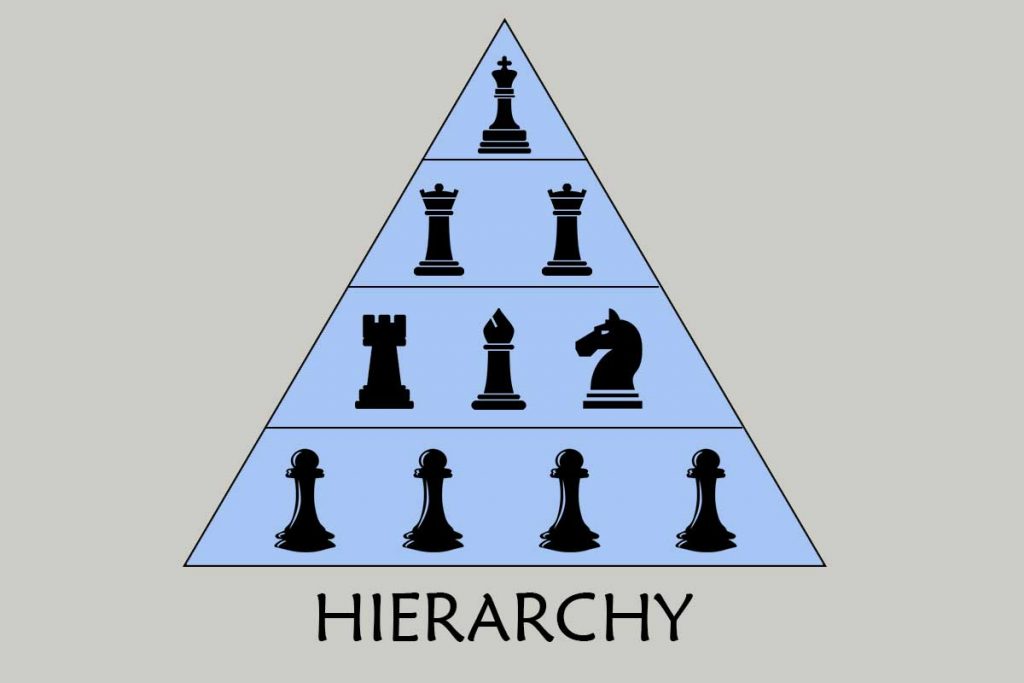
The visual arrangement of design components which signifies the importance of the elements by their size is called Hierarchy [Learn More about Hierarchy]. Thus, the largest and the smallest elements are the most important and the least important respectively. This visual distribution of your website design elements according to their importance definitely calls for focusing on the hierarchy. If you’ve created a semantic workflow in your HTML markup, your web page already comes with a hierarchy. Your design just needs to emphasize the appropriate element such as making H1 and H2 headlines.

You also need to understand how viewers’ eyes move around a web page in Z pattern. Visitors begin from the top left corner to top right corner and comes down according to the Z pattern. This pattern and user behavior make the top-left corner the most significant, so, you may put your company’s logo (the most important thing) there. At the top-right corner, you can put the second-most important thing on your website (like navigation or search bar).
How to Incorporate Emphasis in Web Design
There are various methods how you can implement the emphasis in your website’s design. Below are some techniques to implement.
- Emphasis can even be provided without styling by using semantic markup.
- Font and image sizes can be modified to emphasize or de-emphasize those components in the design.
- Contrasting colors can be utilized to provide emphasis.
- Size always matters. Using a gigantic word would grab instant attention.
- White space (or empty space) should be used to surround the focal point.
- Word or image repetition can effectively draw the eyeballs.
Subordination – Where Does It Fit?

Subordination may have various causes to happen. Toning down the other elements to make a component shine is one of the huge ways of subordination. One fine instance can be using colorful images in contrast to black and white background. The identical effect pops up when you make use of the colors that mix with the background behind the focal point or muted colors. It causes the focal point to stand out.
So, you have read everything about the emphasis in web design and how to implement it in the right way. If you want to succeed in the website designing field, you have to learn the techniques to emphasize some elements of your design which you want to highlight. Above are the most effective techniques to win the game of highlighting the design. Now, it’s your turn to implement the techniques we have mentioned.


