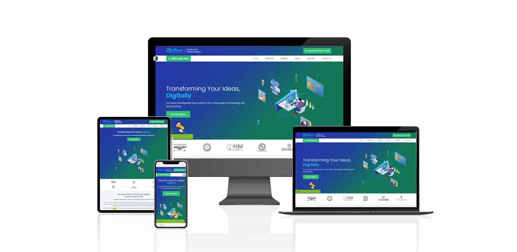
Gone are those days when mobile responsiveness used to be a trend in the web design and development industry. With almost 3.5 billion smartphone users in the globe in 2020, mobile responsiveness is as important as having a website for your business. Therefore, it is important to know about the best responsive design practices to follow in 2020 to stay relevant and win customers.
Individuals are now more comfortable browsing through their mobile phones instead of sitting in front of the laptop or desktop. It’s all about convenience: whether you’re traveling or you’re lying on your bed and about to sleep, you can reach your mobile at any time and visit a website or make an order. And this is not just an assumption, we have data to back up our claim.
51.5% of the worldwide website traffic has been generated through mobile devices (discounting tablets) alone in the third quarter of 2019.
So, it’s very much evident that your website must be mobile responsive. And a lot of people are optimizing their websites for mobile devices. However, not everyone does it correctly so that it can meet user expectations.
That is the reason why we are here with seven responsive web design practices that you can follow to improve your website’s user experience across every device.
6 Best Responsive Design Practices to Follow in 2020
Take a look at the following six practices and see if your website has anything missing. These are handpicked after a thorough analysis and interviewing a few selected web design experts.
Minimize and Prioritize
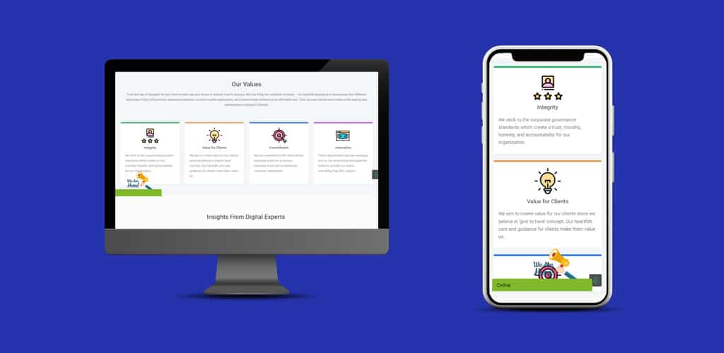
On the desktop version of a website, you have a lot of space to play with. Thus, your design looks better and has a bigger space. The wider sections and space on the desktop allow your content to breathe properly in your design. But when it comes to the mobile devices, you have to make sure that the content does not pile up and increase the length of the page to a great extent.
Often, you’d find sections in websites where smaller contents are placed next to one another in different columns. And when they are made mobile-responsive, those contents are placed on top of one another. So, that increases the length of the page, but not a lot.
Note, if four or five columns of small contents are there, that would not increase the length of the page a lot on the mobile-responsive version of your website. But if there are 10-12 smaller content sections, the responsive page on the mobile device would be very lengthy, which hampers the user experience.
Apart from the length, there are other considerable factors like interactions and font, which need to be taken care of.
Solution
Generally, web designers design from the desktop perspective. And then it is made responsive to mobiles by making a few tweaks to the elements as mentioned above. But if you want to keep your website truly mobile-friendly, design with the mobile in mind.
The mobile-first design would help you make it properly responsive and offer the best experience to hundreds of mobile users out there. Once the mobile design is done, you may optimize the design for desktop by improving the design even more as you get a lot of space there.
Keep the Key Call-To-Action Properly Visible

No matter what your business and website are about, there would always be a key call-to-action (CTA) you’d like the customers to complete. Be it, purchasing products, installing software, scheduling a consultation, or downloading a file, it is the main CTA that matters the most.
Mostly, these CTAs are featured on the navigation menu throughout the website on the desktop to keep it visible to potential customers. It is no secret that navigation is one of the most visible sections of your website and it is also one of the primary ways of having people take the action that you want them to take. This is the reason why having one key CTA button on navigation is important.
Now, here’s where people make mistake while making the website responsive. If you notice, you’ll find that the mobile versions of the websites have a hamburger menu (with three horizontal lines), where the entire desktop navigation stays. Quite naturally, the key CTA is also removed from its actual position, which has a lethal effect on your conversion.
Solution
While converting the desktop design into a mobile-responsive version, keep the key CTA visible throughout the mobile site.
Use SVG (Scalable Vector Graphic) Images

One problem often found in the responsive websites is that the images used there are unclear and look poor. This happens because of the change in resolution. When the low-resolution images are enlarged, they pixelate, and the same happens when a high-resolution image is shrunk into lower resolution space.
So, when the same images used on the desktop website are used on the mobile version, they pixelate, and the poor output deteriorates the user experience.
Solution
If you are using icons or illustrations in your responsive website, it’s highly recommended to use the SVG images since the SVG images are infinitely scalable in nature, unlike the PNG or JPG. When you make use of the SVG images, you can rest assured that the images will stay sharp and unchanged regardless of the change in resolution.
So, it does not matter where your website is opened, the SVG images will offer a sharp look that would add to the user experience.
Moreover, Scalable Vector Graphics have smaller image size, compared to jpg and png, which would help you achieve a faster website loading time as well!
Optimize Clickable Areas and Buttons

One significant difference between desktop and mobile is that a mouse is used while operating on desktop, and when it comes to mobiles, fingers are used. Now, the question is what difference does it make in real life and the responsiveness process.
While using a mouse, you have an accurate pointer that you can use to click on links and buttons that are small. But it would not be possible when you are using your own fingers to tap on the same link and button.
If the clickable areas and buttons are not optimized while making a website responsive, it will surely diminish the user experience.
Solution
This should be considered among the best responsive design practices to follow in 2020. Since the human fingers are being used instead of a precise mouse click, the interactive areas need to be made larger so that it can fit the fingers. It is not possible to provide the perfect size since it depends on the operating person, but on an average, 48 pixels of height is considered the minimum.
The inline links, buttons, card layouts, form inputs, navigation links, and others should be optimized and made larger. While you may face difficulties following this approach on the inline links, you can follow a trick: instead of hyperlinking one or two words, you may try to hyperlink four to five words which will offer the users more space to tap.
Responsive Image
This is known to many but worth mentioning. Different image sizes are required by different devices. While a desktop page may require 1080 pixels width for an image, the same page on a mobile device may need 300 pixels for the image. That is almost one-third of the image size, and that should lead to almost one-third of the file size as well.
The old way of making the images responsive was to load the original image size (1080px) and use it on all the devices simultaneously. Then the size is shrunk to the required size in the device (300px) once loaded. However, that would surely add to your page loading time, making the loading time longer.
Solution
If you want to do things right and want to get the best responsive experience, using two versions (for mobile and desktop) of the same image would be the right thing to do. Rather than loading the larger image and having it shrink when loaded completely, calling up the smaller version of the image would certainly help you with noticeably faster loading time.
Typography and Font

Typography and font are something where a lot of designers make mistakes! You need to understand that readability affects the user experience the most. It may happen that you’ve used a typography and font size that look exceptionally stylish and appealing on desktops but when a user opens your website on mobile, the same typography and font reduce the readability on the small screen! And if users feel the slightest discomfort while reading your content, they won’t stick around!
Solution
The typography, font size, and style should be easy to read and optimized for all the devices. You also need to work hard and take notes while using any typefaces on the desktop version of your website and decide if it would look good on the mobile device as well! Never forget to balance the heading and body font sizes according to the devices.
Making Websites Responsive is a Necessity
We are living in the age of mobiles where every single task is being performed in the tiny devices we can hold in our hands while sitting, lying, or traveling! The increasing number of mobile traffic should be an eye-opener for you that a large number of your potential consumers are using mobile devices to find you. A sub-par mobile experience would be the last thing you want. If the situation demands, you should even go for a complete website redesign where you can follow these responsive design practices that are absolutely necessary for 2020.


